LIGHT SPRING FOLIAGE
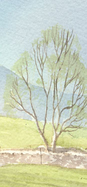
Spring is a great time of year for the artist. Although I must confess to feeling more in tune with the warm colours of Autumn and the stark bleakness of Winter, Spring always fascinates me, with its delicate beginnings and fresh aura. In the field that backs on to where I live, lambs are bounding around like they have springs attached to their feet, and the trees that line their field are just starting to show signs of new growth.
Whilst summer foliage appears as intense blocks of green, with clearly defined light- mid- and dark-tones, its spring counterpart is a little more tricky to nail down. It should appear subtle and light, and the easiest way to show this in watercolour is to paint the tree as if in winter, then overlay a light wash of fresh green. Your choice of green is very much a matter of personal choice – I tend to avoid ready-made greens, preferring instead to mix my own from Cadmium Yellow and Prussian Blue.
Bluebells, when they arrive, are best painted in a mixture of Cobalt Violet and Cobalt Blue for the light tones, and a mix of French Ultramarine and Alizarin Crimson for the darker tones. Snowdrops are best masked-out, as are the lighter of the blossoms.