Composition Checklist
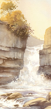
All paintings consist of shapes, lines, tones and colours (and nothing more – sometimes we have to remind ourselves of that, when things start going pear-shaped). How those items are arranged upon the paper is what we call Composition. The art of good composition is to understand the how, and why, and the ability to implement rules that have been established over many thousands of years. Of course; being controversial can be exhilerating, but you ignore those rules at your peril!
This is a shortlist of what I consider to be the most important points; there are many others, but these are the ones that seem to create the most common issues. It’s a list that may help you when planning a new painting, or it could also be used as a troubleshooting guide; sometimes, when a painting isn’t looking right – you know there’s something wrong with it, but you can’t quite put your finger on what… the answer might be here…
Focal Point
This is by far the most important element of any painting. Every painting should have only one Focal Point, which could be an object, a group of several objects, or even a space between objects. Essentially, this is where the eye should finish up, whether by direct or meandering paths. The rest of the composition should support that focal point, help to draw the eye towards it, and not compete or distract the eye away from it. More than one focal point, vying for the viewer’s attention, will almost certainly undermine and weaken the overall composition.
Tonal Contrasts
This is the strategic positioning of light values against dark values. A painting can be created using just one or two colours; if we have a light tone set against a similar light tone, then we lose definition. So, we should always be on the lookout for contrasting tones – capitalize upon them, exaggerate them, and where necessary, engineer them.
Variation and Alternation
One of the hardest things we have to do in watercolour landscape painting is to generate the ‘random’ element. Avoiding the patternlike repetition of shapes and spacing is paramount when it comes to painting natural subjects. If your scene has a line of trees, all the same size and shape, and all spaced equally apart, for instance, you might want to consider altering, or alternating, those shapes (or changing your viewpoint entirely), in order to make the composition a little more visually interesting.
Coincidences
Magical alignments, visual coincidences, can happen any time to anybody. It’s the painting equivalent of taking a photograph of somebody, and when you look at the photo, they have a tree growing out the top of their head. The worse thing is; it can happen and you not even realise it – until it’s too late, or until someone else rather embarrassingly points it out to you.
Linking the Elements
A painting can be generally by broken down into regions, some more clearly defined than others, which should be linked together somehow. The worse possible scenario would be one in which lots of objects bear no relation to each other at all. Look for ways to link areas together (puddles are a great way to disperse colour from the top half of a painting, down into the bottom half, for example). Objects that overlap and partially obscure each other in a visually interesting way is one solution. Avoid breaking the painting up into geometrically-shaped areas wherever possible.